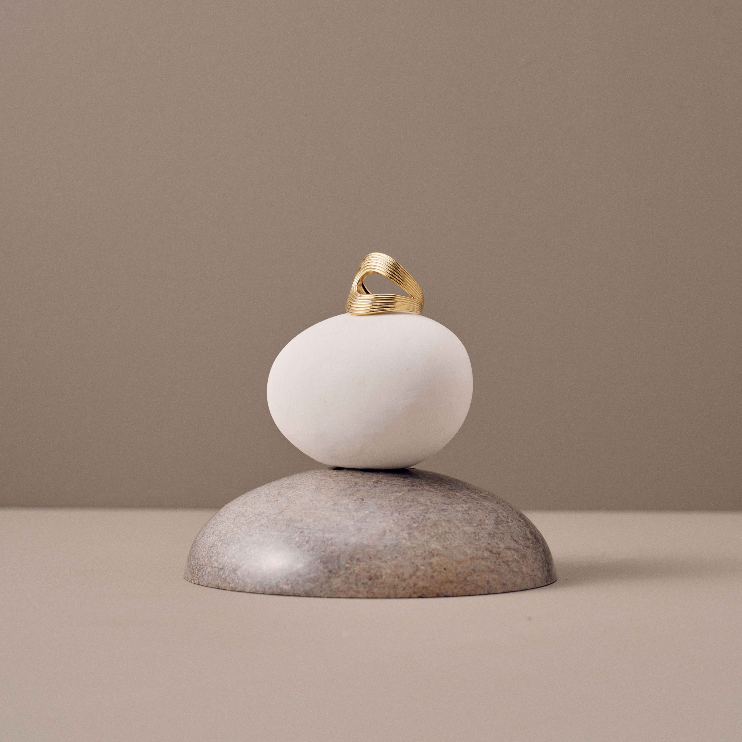
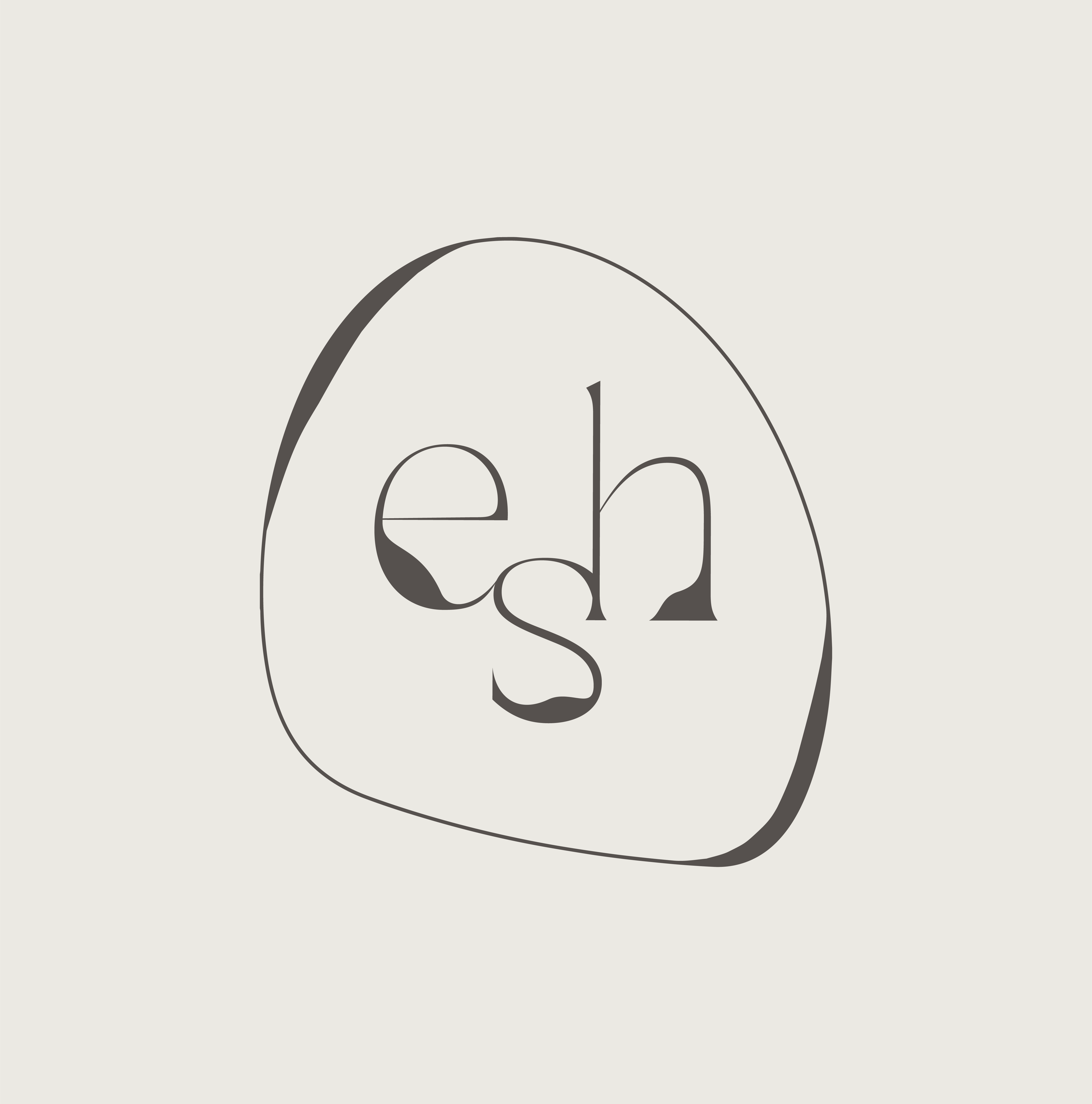
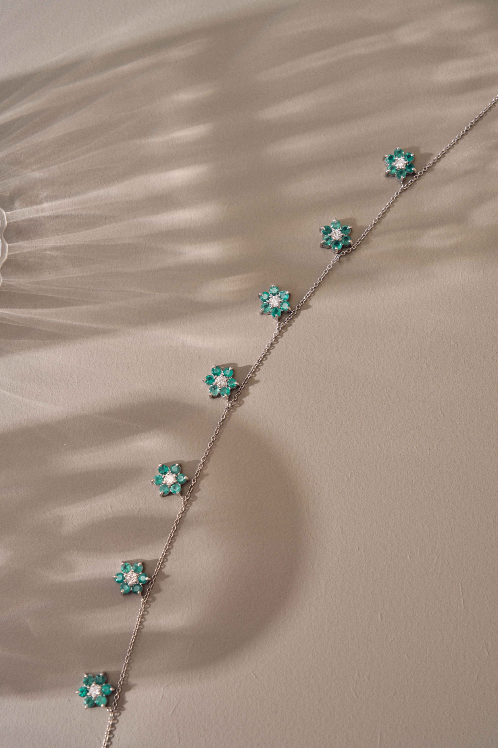
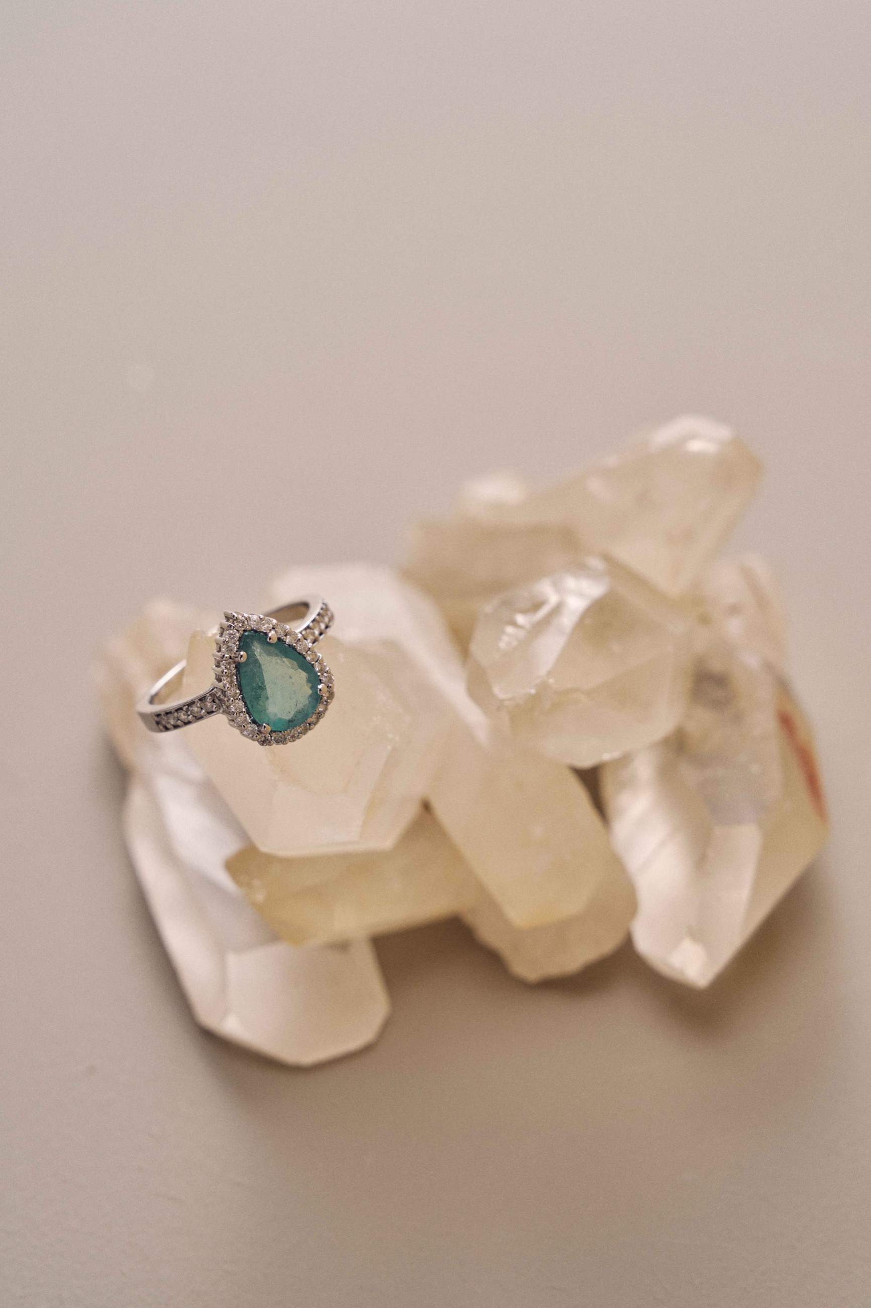
ESH's identity pairs a delicate serif wordmark with a fluid symbol and a quiet, mineral palette, creating a refined frame for expressive fine jewelry.
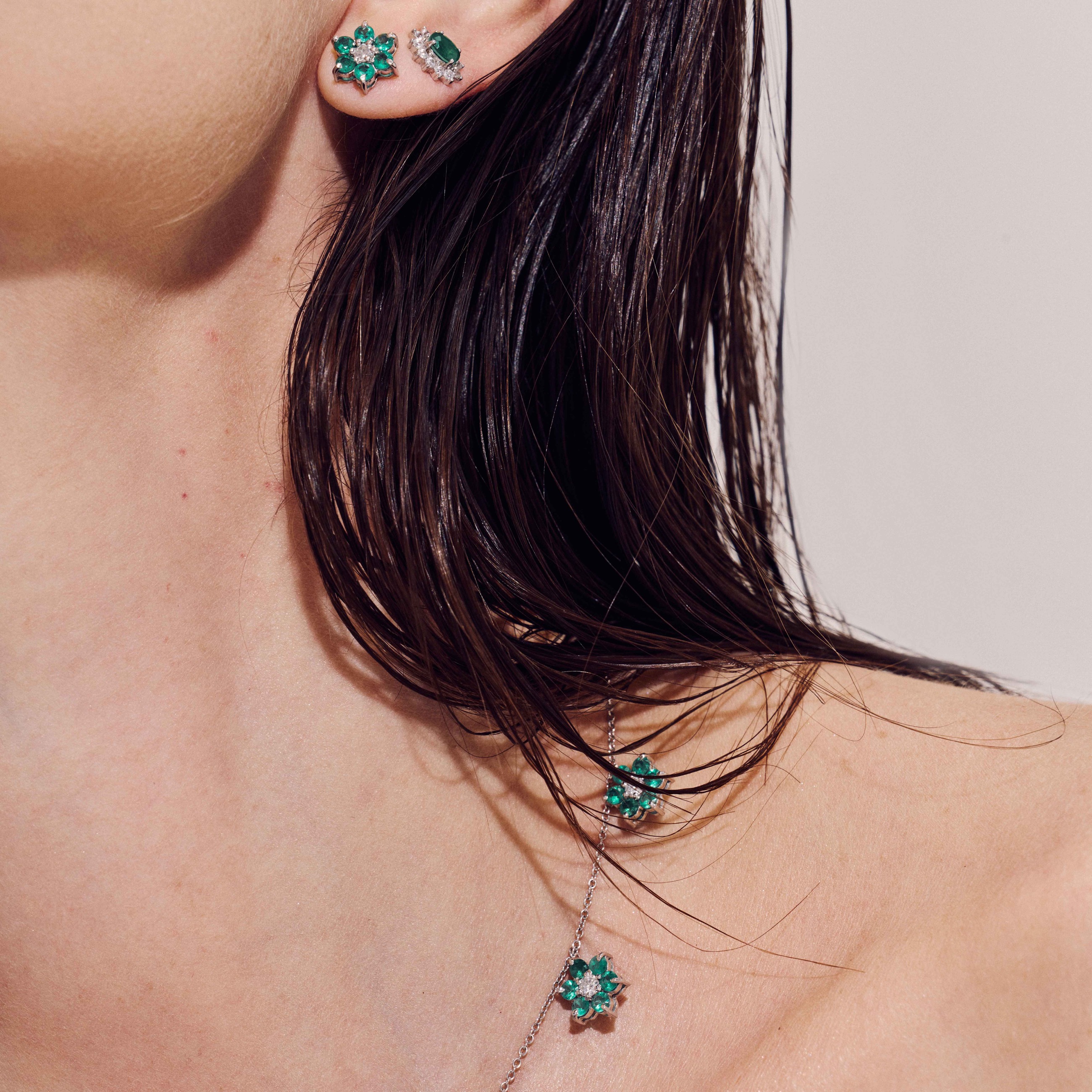
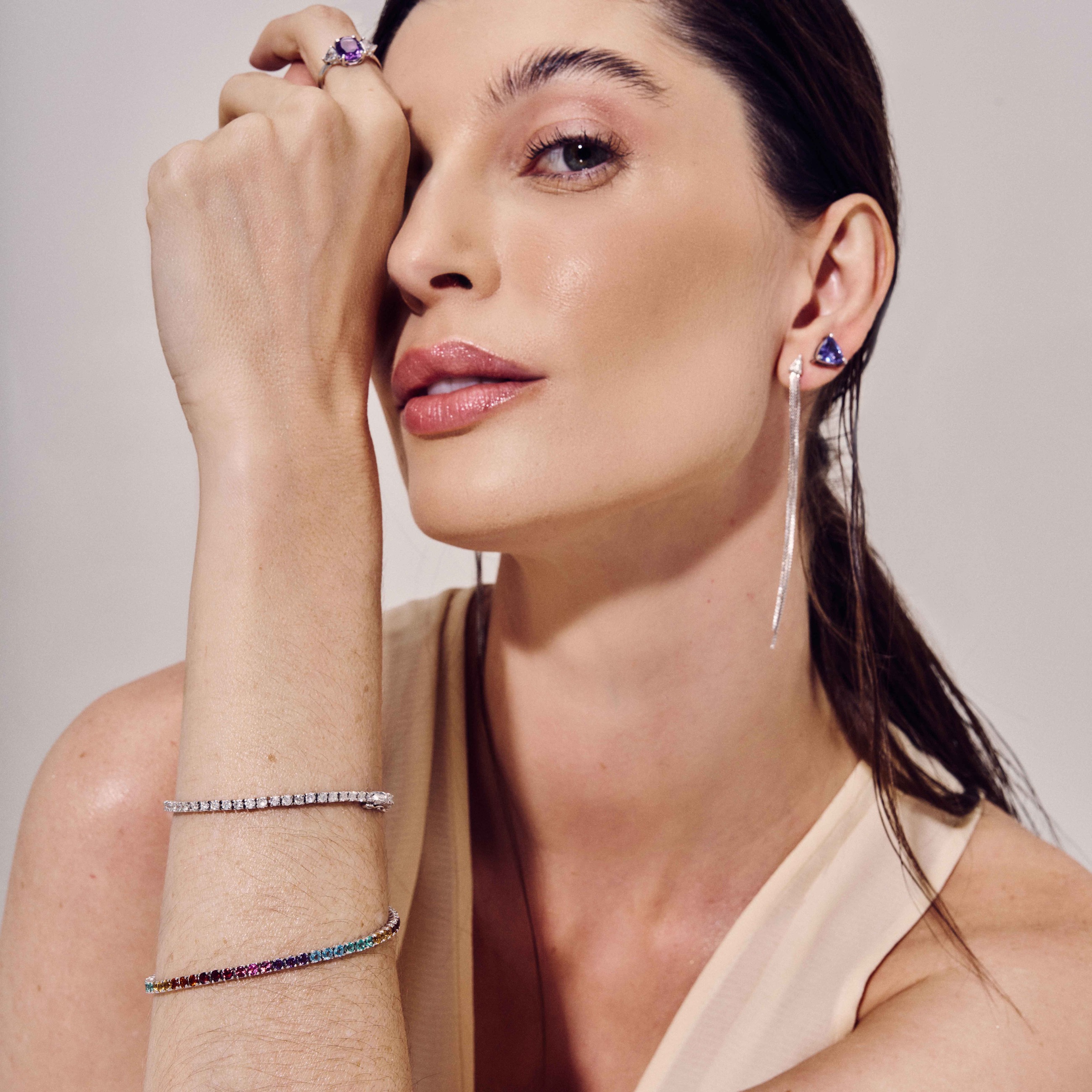
The system was developed across typography, color, packaging and digital communication, then carried into campaign image-making through close crops, sculptural still lifes and an intimate focus on the pieces.