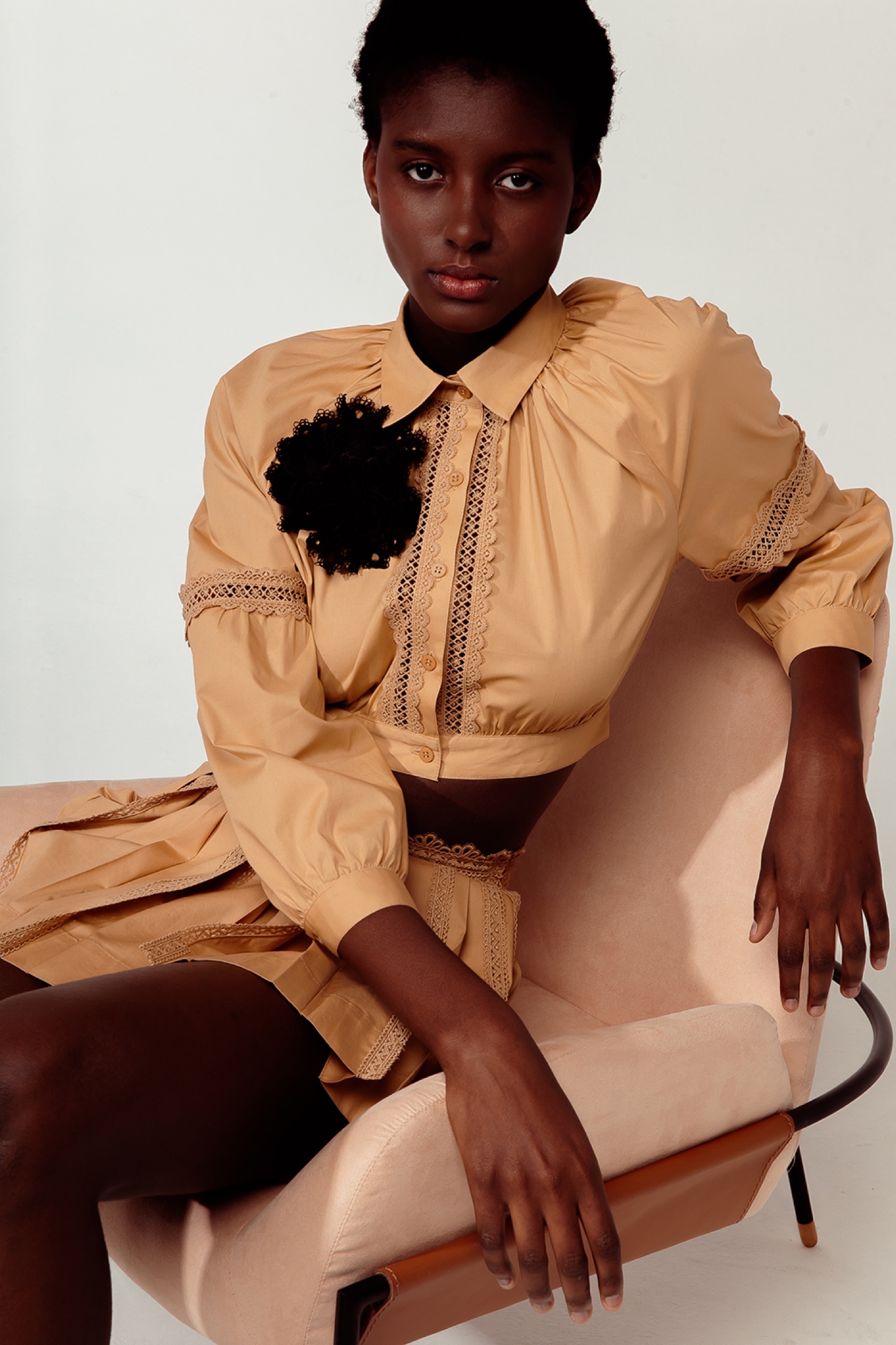
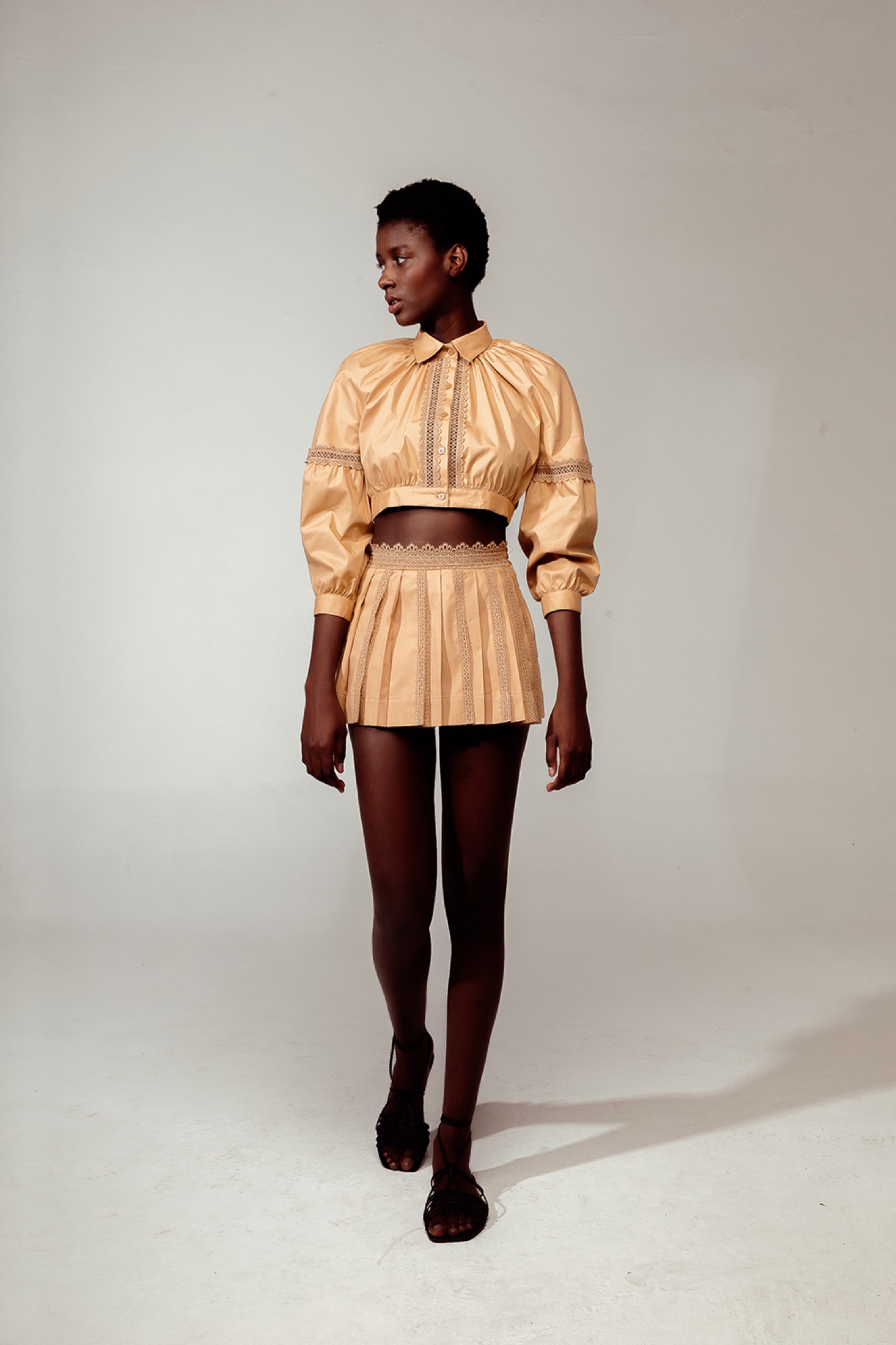
La Gea's visual identity was developed to translate the meeting point between Brazilian resortwear and an Italian sense of luxury. A refined wordmark, contrasting type families and a restrained palette formed a system that extended to stationery and packaging, including shopping bags, garment labels and clothing tags, as well as editorial and digital communication.
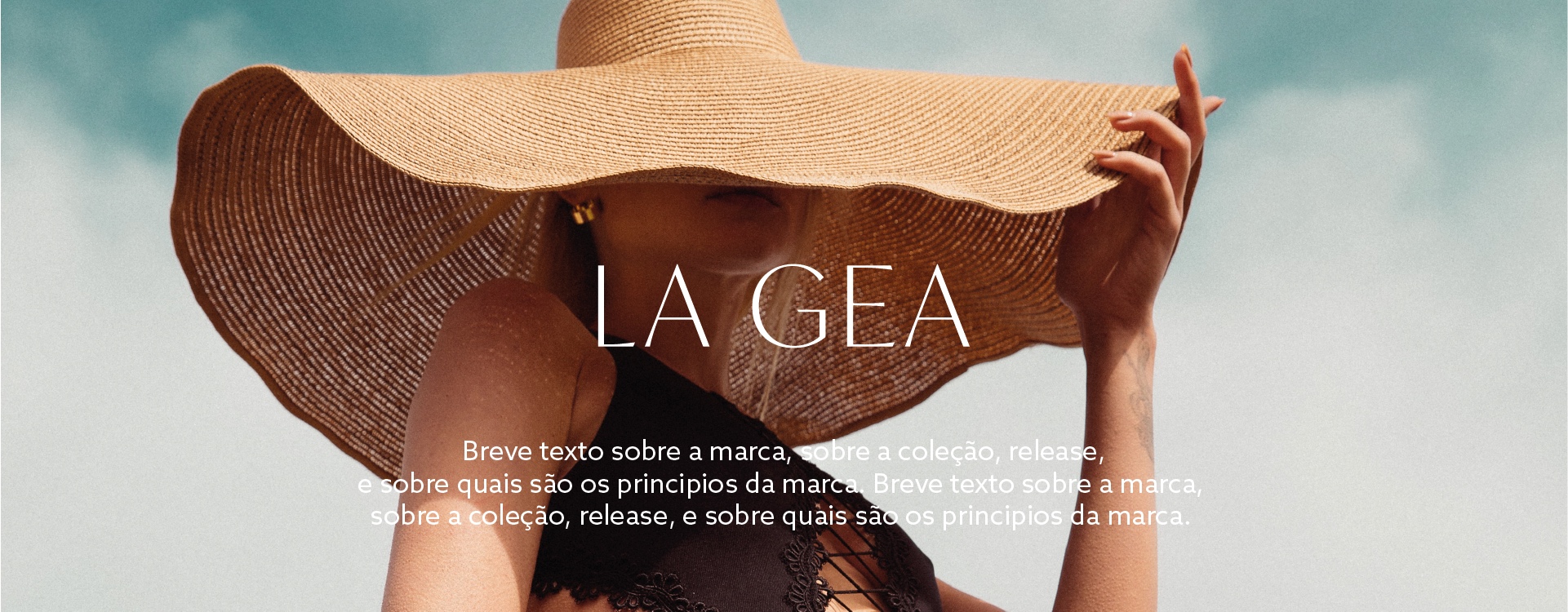
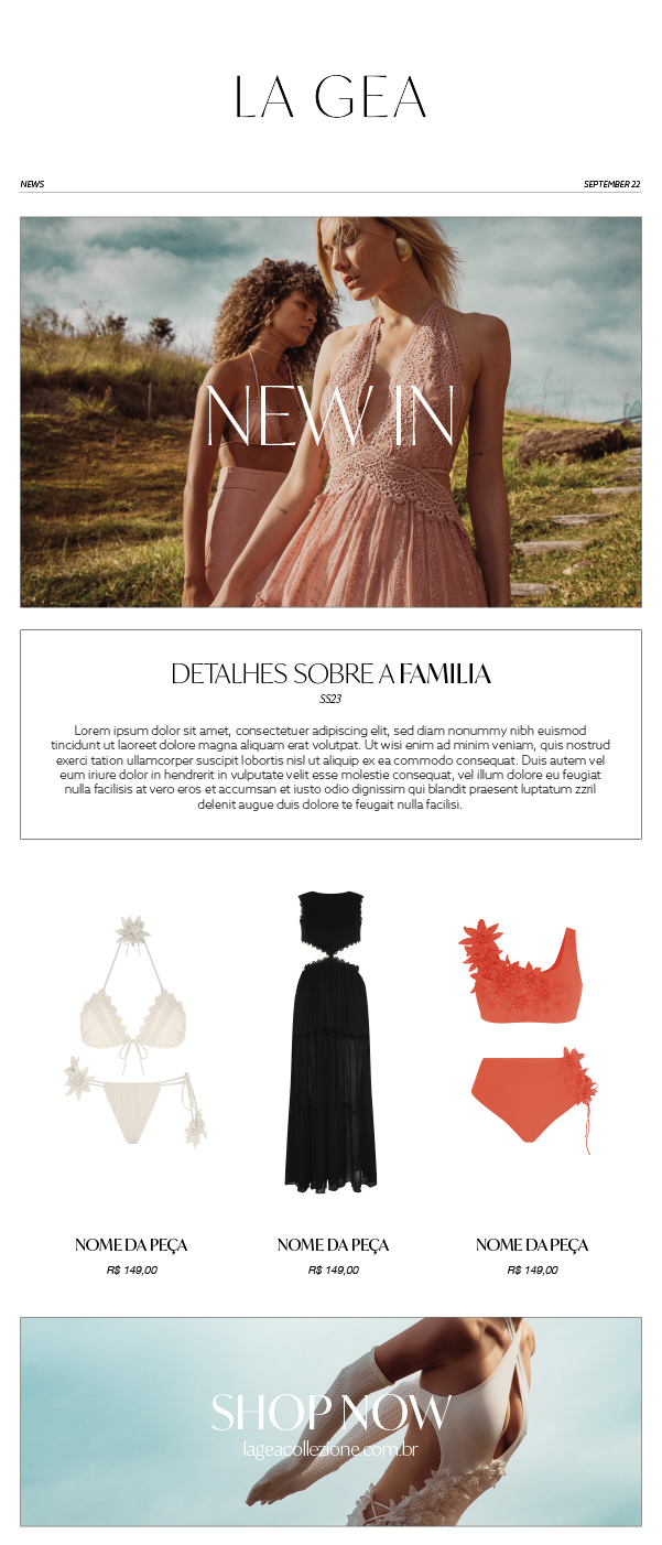
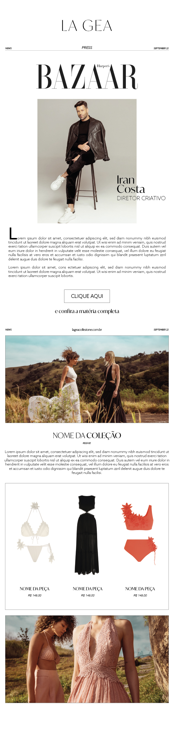
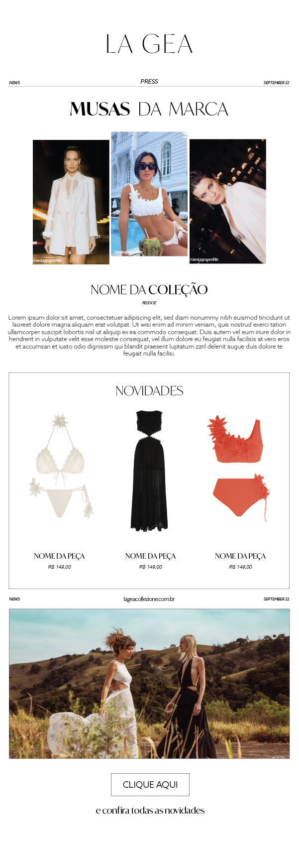
The collaboration later continued independently through a series of key visuals for email marketing and the e-commerce experience. Campaign, press and new-in communications became a responsive system, keeping image, typography and commercial content consistent across desktop, mobile and the inbox.

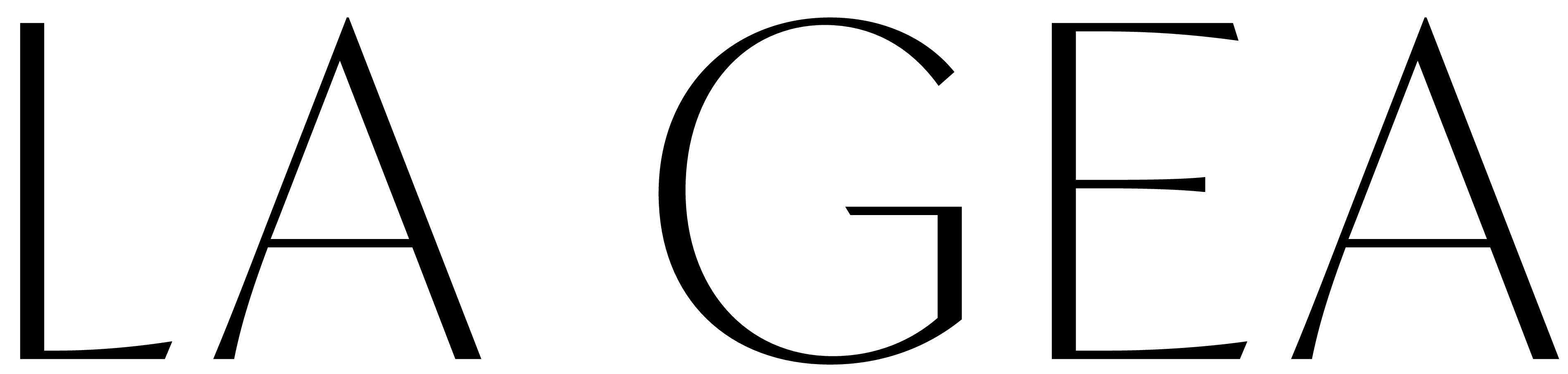
Wordmark
The wordmark was refined through close adjustments to proportion, spacing and the transition between thick and thin strokes. The distinctive construction of the G became the central gesture of the identity, balancing a classical fashion vocabulary with a more direct contemporary presence.