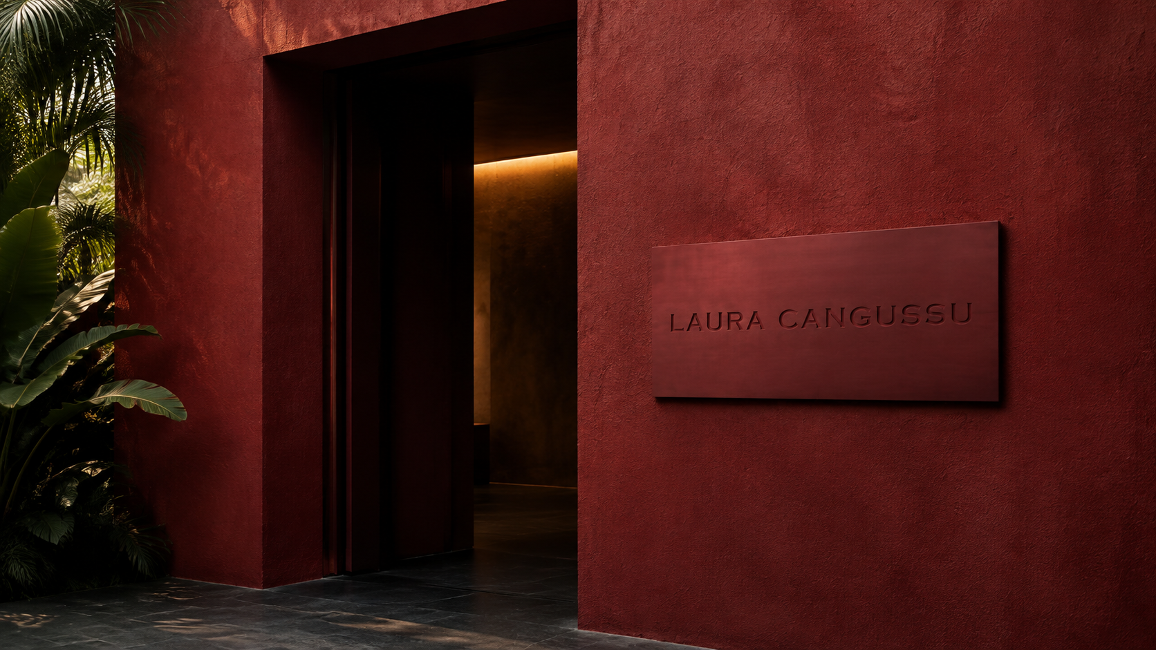
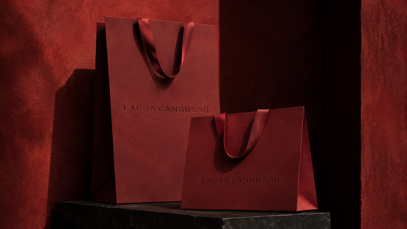
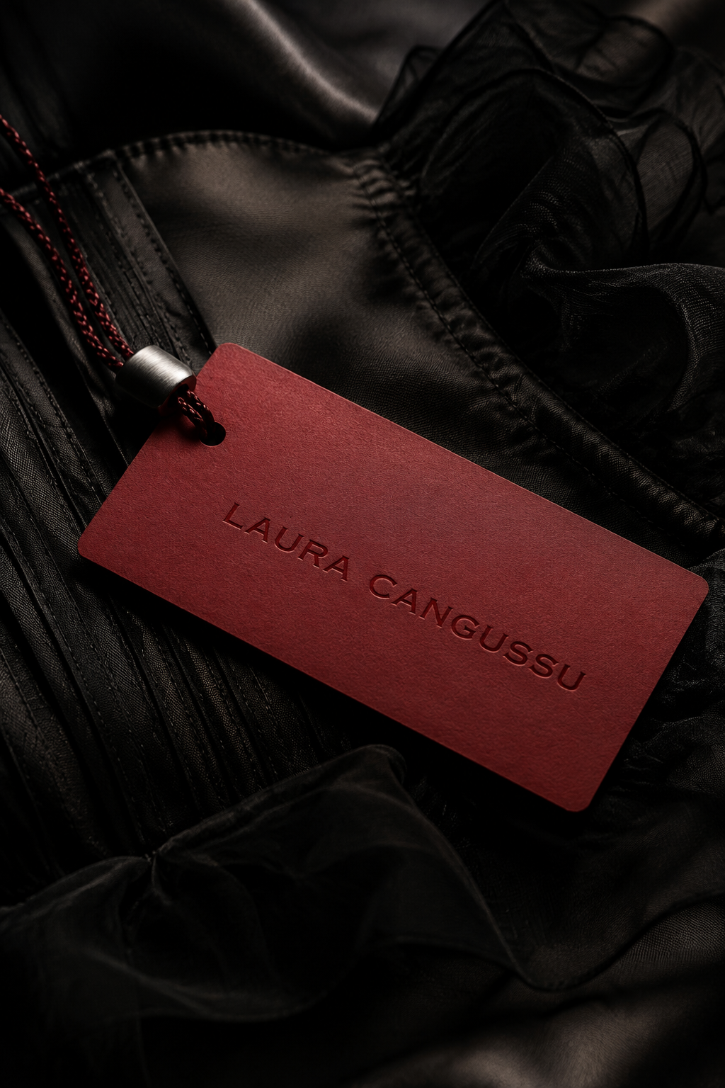
Laura Cangussu is a Brazilian fashion label seeking a stronger, more distinctive presence. The rebrand was conceived as a refined identity system that could bring personality and recognition to every touchpoint, from packaging to digital.

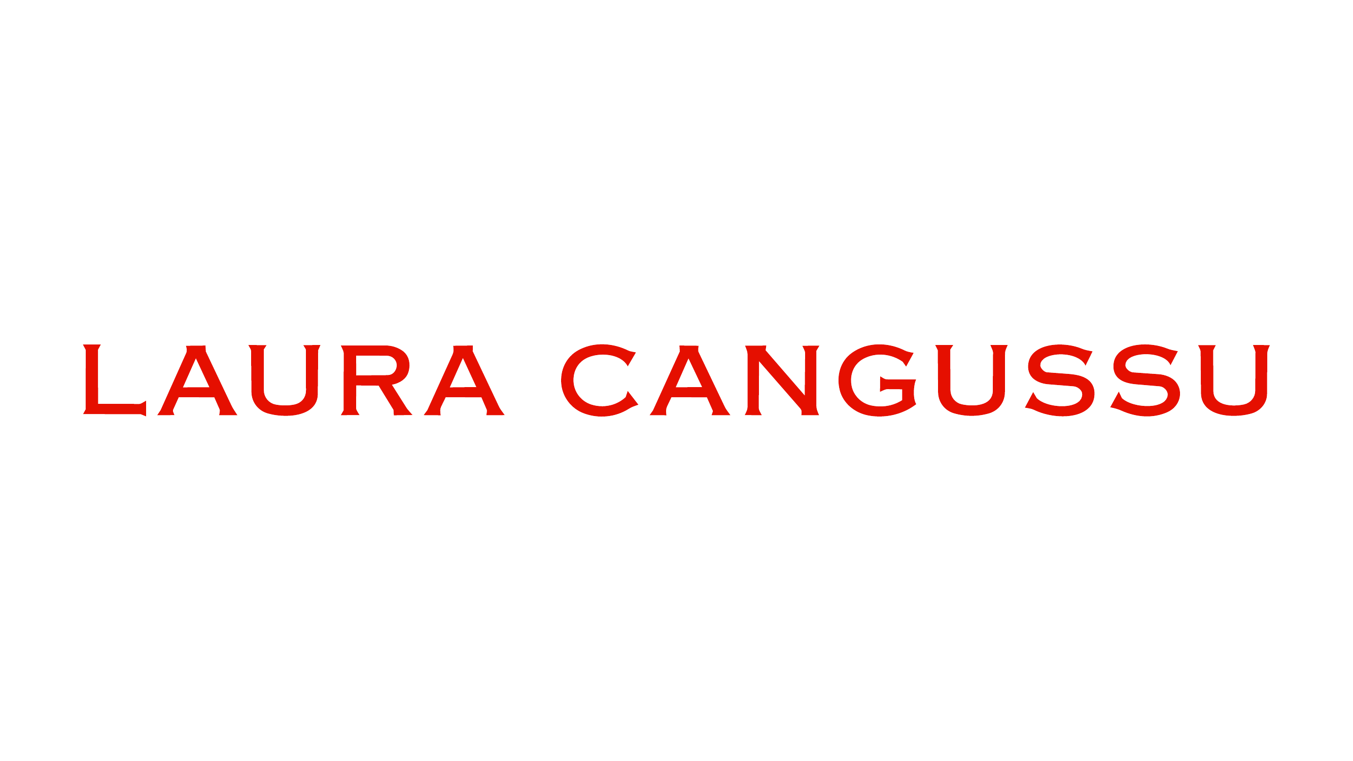
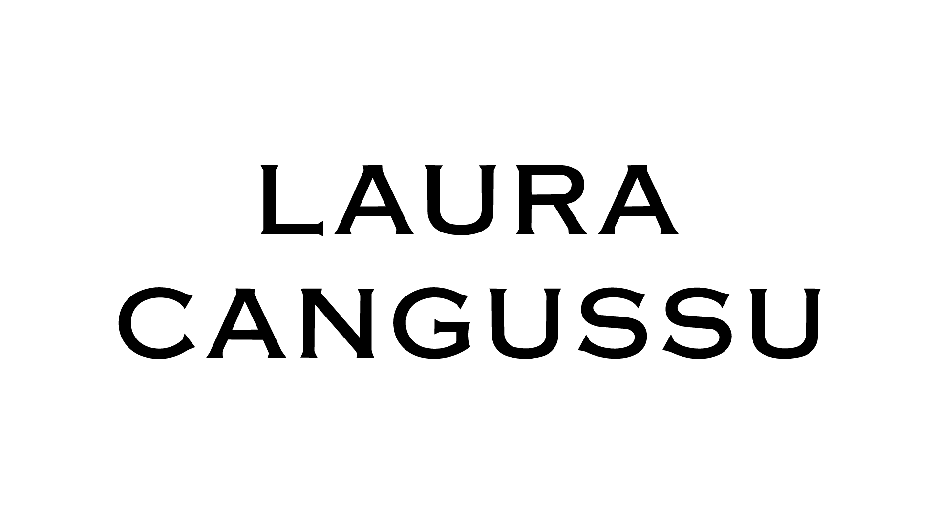
Pointed cuts in the serif letterforms subtly recall the claws of a jaguar — a reference connected to strength and Brazilian identity. A red-on-red palette builds intensity, while black and off-white bring contrast and space.
Laura Cangussu

I AM LAB, 2026

Art Direction & Design: Lucas Coimbra

Scope: Rebranding, Visual Identity, Packaging, Digital

Status: Unreleased Identity Proposal

Campaign Photography: Pre-existing brand imagery, used for visualization only

Laura Cangussu horizontal wordmark
Stacked Laura Cangussu wordmark
Laura Cangussu wordmark applied to a tonal red boutique entrance plaque
Red-on-red Laura Cangussu shopping bags
Tonal Laura Cangussu garment hangtag on black fabric