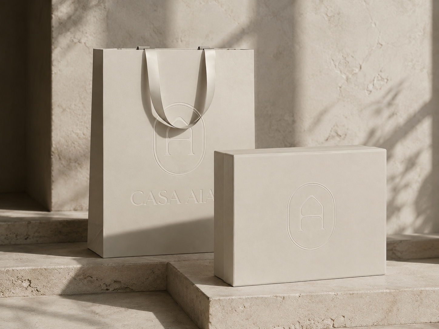
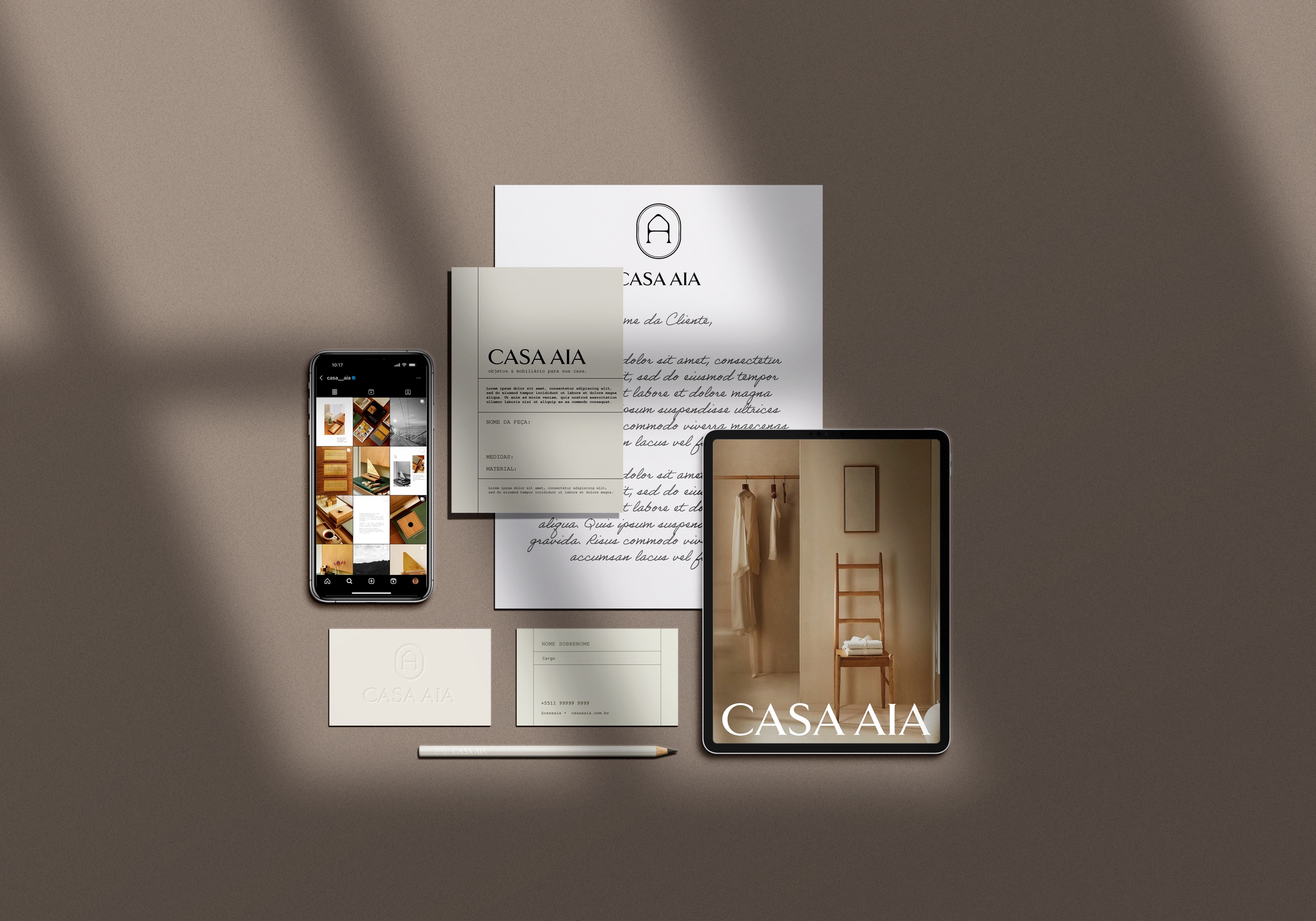
Casa AIA needed an identity capable of expressing the personality, seriousness and sense of tradition that its previous presence lacked. The rebranding introduced a quieter, more considered visual language for a brand devoted to authorial wooden objects and furniture.
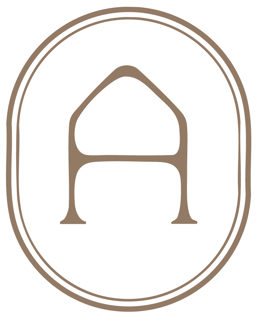
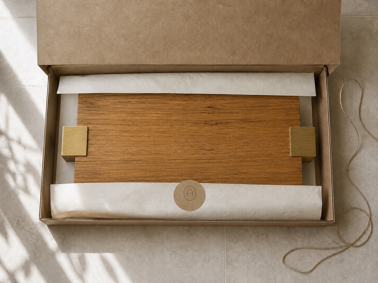
The system pairs a serif wordmark with a monogram built from the letter A, reshaped into the silhouette of a house. A restrained palette of black, warm taupe and soft neutrals extends the identity across certificates, large-format packaging, seals, natural string closures and digital applications — balancing craft, permanence and a refined point of view.